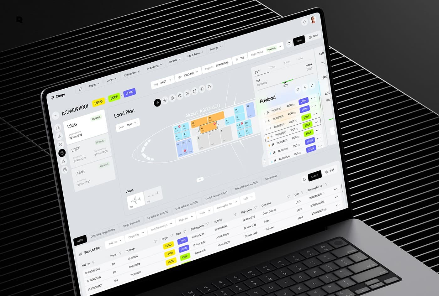
Editorial Details
A minimal interface should still feel rich. The work is in reducing noise while keeping the product easy to read and simple to use.
Fast interfaces are usually the result of disciplined decisions, not decorative ones. Every extra surface, motion, and label increases the cognitive load of using a product. In digital design, speed is more than a technical metric; it is the cornerstone of trust. When a system responds instantly, users feel in control and confident in the tool they are using.
To achieve this, we start by stripping away the unnecessary. This means audits of every visual element: shadows, borders, fills, and custom fonts. We ask ourselves: does this detail help the user take their next action, or does it simply distract them? When you reduce visual noise, the content itself stands out, automatically making the system more legible and intuitive.
However, minimal design must not become sterile. A completely flat, empty interface lacks signposts, causing confusion. The challenge lies in placing subtle micro-interactions and high-contrast indicators that guide the user's attention without screaming for it. A soft transition, a carefully measured spacing system, and a precise typography scale are often enough to make a product feel alive.
We also focus heavily on layout stability. As pages load or content updates, elements should never shift unexpectedly. Dynamic content needs reserved dimensions, and transitions must be predictable. This physical consistency creates muscle memory for users, enabling them to navigate the platform with ease and speed over time.
The final layer is performance engineering on the front end. Modern tools like Next.js and Tailwind allow us to ship minimal code, but it requires developer discipline to keep bundles light and interactions clean. When design intent and code optimization align, we create products that feel calm, direct, and exceptionally responsive.


Get started now!
It takes less than a minute of your time.